Let’s take a closer look at the current Atlanta flag.

The five basic design principles of a good flag, as outlined by Ted Kaye, vexillologist (the study of flags) and author of Good Flag, Bad Flag, are as follows:
- Keep it simple.
- Use meaningful symbolism.
- Use two to three basic colors.
- No lettering or seals.
- Be distinctive or be relative.
At best, one could maintain that the Atlanta flag breaks three of these five basic rules. Let’s break it down:
1. KEEP IT SIMPLE
“The flag should be so simple that a child can draw it from memory.”
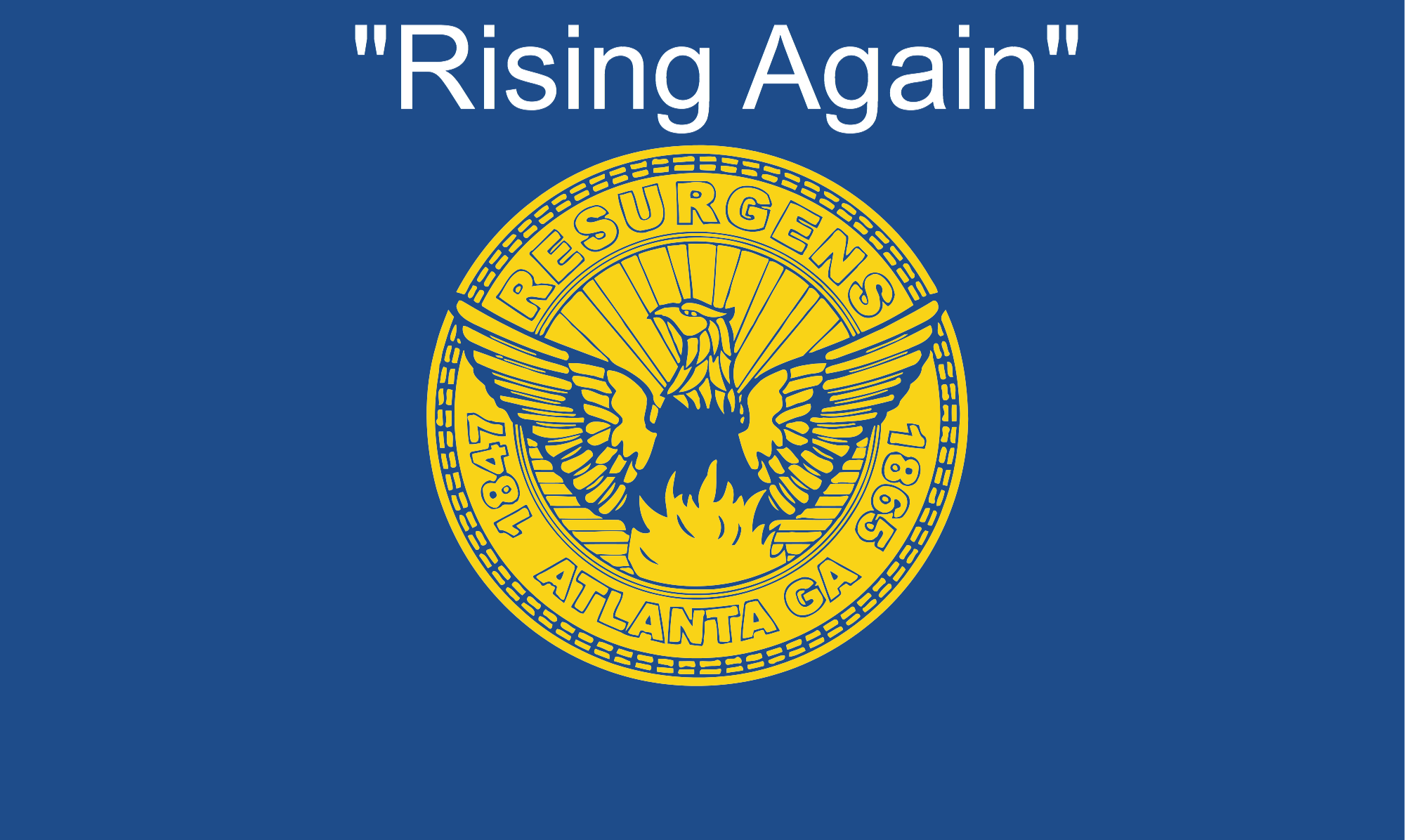
The municipal seal prominently featured in the center of the flag is complicated, intricate, and anything but but simple. More on this later…
Without the seal, the flag is somewhat simple…

2. USE MEANINGFUL SYMBOLISM
“The flag’s images, colors, or patterns should relate to what it symbolizes.”
While the flag itself has no meaning, the seal, with descriptive writing, does derive some symbolism. The city charter gives an apt description of the city seal:
“The device thereon shall consist of an engraving of a phoenix rising from its ashes and the inscription, “Resurgens 1847-1865;” the word meaning “rising again,” the first date marking the year the city’s first charter was granted and the second date signifying the year of the beginning of the city’s rehabilitation after its destruction by the Federal armies in 1864.”
3. USE TWO TO THREE BASIC COLORS
“Limit the number of colors on the flag to three, which contrast well and come from the standard color set.”
There are two prominent colors: blue and yellow. The seal on its own is multicolored but for the purposes of the flag it has been flattened to yellow.

4. NO LETTERING OR SEALS
“Never use writing of any kind or an organization’s seal.”
One of the biggest, most fundamental problems with our flag is the city seal featured prominently at its center. Municipal seals are designed for pieces of paper. They are intricate and meant to be viewed inches from your face. When a seal is placed on a flag a hundred feet away flapping in the wind, the seal is rendered illegible and the flag unrecognizable, thus defeating the purpose of both seal and flag altogether.
5. BE DISTINCTIVE OR BE RELATIVE
“Avoid duplicating other flags, but use similarities to show connections.”